How to Use CSS Grid to Build a Responsive React App

Do you remember the days when people used tables to arrange content on websites? HTML tables were ideal for arranging content in a grid-style layout. But they had a serious problem. They mixed content with style, prohibited semantic markup, and made it hard for screen readers to sort the information in a meaningful way.
After dropping the use of tables, the first solution was to use the CSS float to position elements on a web page. But floats are clumsy, fragile, and generally hard to work with. CSS frameworks—like Bootstrap or Zurb Foundation—sprung up to help with the difficulties of creating a responsive grid layout. But these frameworks have their own learning curve and often introduce significant overhead in unused CSS code.
Along came flexbox to help with some of these problems. It made it a lot easier to create a responsive row or column-based layouts. While flexbox is a huge step forward, it doesn’t adequately address all the needs of front-end designers. Designers for print media usually work with a grid system that organizes content on a page. And the need for a method of arranging content in a 2-dimensional space that uses the same concepts that have been used by print designers for many years was recognized.
The CSS grid layout allows you to specify a grid system on your web page and place content inside the grid cells in a responsive manner. Elements inside the grid can span multiple rows or columns while maintaining the correct row heights and gutter spacings. The CSS grid is not supposed to replace flexbox but to work alongside it to create truly professional layouts.
In this tutorial, I will show you how to create a single page application that uses CSS grids to create a responsive layout without using media queries. The application will be a simple Unicode character browser implemented with React.
Table of Contents
- Create a Unicode Browser App with React
- Add a Responsive Layout with CSS Grid
- Add Authentication with Okta
- Learn More About Styling Your Single-Page Applications
Note: In May 2025, the Okta Integrator Free Plan replaced Okta Developer Edition Accounts, and the Okta CLI was deprecated.
We preserved this post for reference, but the instructions no longer work exactly as written. Replace the Okta CLI commands by manually configuring Okta following the instructions in our Developer Documentation.
Create a Unicode Browser App with React
I will assume that you have some familiarity with JavaScript and that you have a recent version of Node installed on your computer. You will first create a React project using the npx command that comes with the Node installation. In a terminal, navigate into a directory of your choice and run the following command.
npx create-react-app react-grid-unicode
This will create a new folder react-grid-unicode and install a skeleton React application into it. Before you start implementing the application, you need to obtain the data files that you will be using for the Unicode look-up. The raw data is available at https://www.unicode.org but, to make your life easier, I have created two JSON files that you will be using for this project. In the terminal, navigate into your new project folder and then into the src/ folder. Now create a new folder called unicode inside the src folder and download and save the following files into it.
If you have wget installed on your system, you can grab these files with the following commands:
wget https://raw.githubusercontent.com/oktadeveloper/okta-react-css-grid-example/master/src/unicode/license.txt
wget https://raw.githubusercontent.com/oktadeveloper/okta-react-css-grid-example/master/src/unicode/blocks.json
wget https://raw.githubusercontent.com/oktadeveloper/okta-react-css-grid-example/master/src/unicode/unicode.json
Next, open your favorite IDE in the project folder and create a new file src/Unicode.js and paste the following content into it.
import React from 'react';
import unicode from './unicode/unicode';
import blocks from './unicode/blocks';

class Unicode extends React.Component {
  constructor(props) {
    super();
    this.state = { results: this.search('') };
  }

  search(query) {
    return unicode
      .filter((entry) => entry.name.toUpperCase().includes(query.toUpperCase()))
      .slice(0, 100);
  }

  selectChar(entry) {
    const codeInt = parseInt(entry.code, 16);
    const block = this.findBlock(codeInt);
    this.setState({
      selected: {
        ...entry,
        html: String.fromCharCode(codeInt),
        block: block && block.name
      }
    });
  }

  findBlock(code) {
    return blocks.filter((b) => (b.from<=code && b.to>=code))[0];
  }

  render() {
    const handleSelect = (entry) => () => {
      this.selectChar(entry);
    };

    const handleSearch = (event) => {
      this.setState({
        results: this.search(event.target.value)
      });
    };

    const resultList = this.state.results.map((entry) =>
      <li key={entry.code}
          onClick={handleSelect(entry)}
          className={(this.state.selected && entry.code===this.state.selected.code) ? 'active' : ''}>
          {entry.name}
      </li>
    );
    const charInfo = this.state.selected
      ? <div>
          <p className="char-name">{ this.state.selected.name }</p>
          <p className="char-block">{ this.state.selected.block }</p>
          <p className="char-code">&#x{ this.state.selected.code };</p>
        </div>
      : undefined;

    return (
      <div className="app-ui">
        <div className="search-input" onChange={handleSearch}><input type="text" placeholder="Search"/></div>
        <div className="search-results">
          <ul>{resultList}</ul>
        </div>
        <div className="char-display">{ this.state.selected && this.state.selected.html }</div>
        <div className="char-info">{ charInfo }</div>
      </div>
    );
  }
}

export default Unicode;
In the code above, the top part includes the import of ./unicode/unicode and ./unicode/blocks. These lines import the JSON files that you downloaded earlier and make them available for the module. The Unicode class is a React component that will render the Unicode browser UI. It implements a number of functions:
search()will search for entries in the Unicode character table based on a search string.selectChar()is called when an entry is selected, and the character information should be displayed.findBlock()finds the Unicode character block for a given Unicode.render()is the React function that renders the component.
In the return statement of the render() function, you can see that the component has four main parts, a search input, the search results, an area that displays the chosen character, and a panel that shows some additional information about that character.
Now you can add this component to your application. Open src/App.js in your editor and replace its content with the code below.
import React from 'react';
import './App.css';
import Unicode from './Unicode';

class App extends React.Component {
  render() {
    return (
      <div className="App">
        <header>
          Unicode Chart
        </header>
        <div className="page">
          <div className="content">
              <Unicode />
          </div>
        </div>
      </div>
    );
  }
}

export default App;
Notice how the <Unicode /> tag is used to place your Unicode component onto the screen. Next, you can give the page some styling by opening src/App.css and replacing the contents with the following.
.App header {
  background-color: #282c34;
  display: flex;
  flex-direction: row;
  align-items: center;
  justify-content: space-between;
  color: white;
  padding: 0.5rem 1rem;
}

.page {
  text-align: center;
  background-color: #f0f0f0;
  min-height: 100vh;
}

.content {
  text-align: left;
  display: inline-block;
  background-color: #ffffff;
  width: 100%;
  max-width: 1232px;
  padding: 16px;
  box-sizing: border-box;
}
At this point, you can try out your application. In a terminal, run the following command.
npm start
Once the application has finished compiling, it should automatically open your browser to http://localhost:3000. You will see something like the image below.
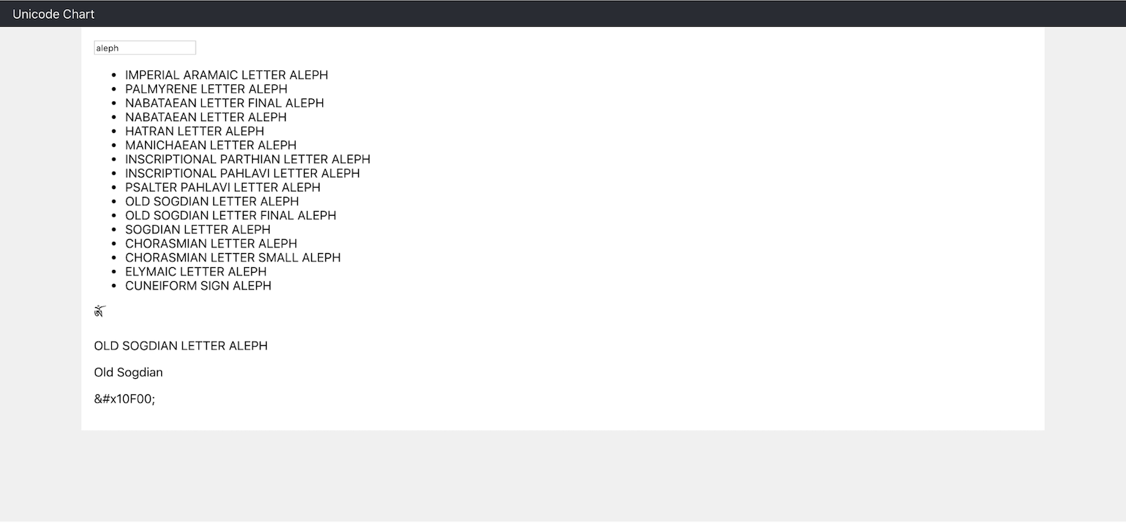
The layout of the user interface is not very nice, of course, because you have not yet applied any styling to it.
Add a Responsive Layout with CSS Grid
In this section, I will show you how to create a responsive layout using a CSS Grid Layout. In your IDE, create a new file src/Unicode.css and paste the following style into it.
.app-ui {
  display: grid;
  grid-template-columns: repeat(auto-fit, minmax(384px, 1fr));
  grid-gap: 16px;
}

.search-input {
  grid-column-start: 1;
  grid-column-end: -1;
}

.search-input input {
  width: 100%;
  box-sizing: border-box;
}

.search-results {
  grid-column-end: span 2;
  grid-row-end: span 2;
  border: 1px solid #e0e0e0;
  overflow: auto;
  max-height: 500px;
}

.search-results ul {
  list-style: none;
  padding: 8px;
  margin: 0;
}

.search-results li.active {
  background-color: #f0f0f0;
}

.char-info {
  text-align: center;
  border: 1px solid #e0e0e0;
  padding: 16px;
}

.char-display {
  text-align: center;
  border: 1px solid #e0e0e0;
  padding: 16px;
  font-family:serif !important;
  font-size: 120px;
}
The line display: grid; in the CSS code above, instructs the browser to layout the contents of the .app-ui container as a grid. The grid-template-columns property specifies the columns of the grid. Using auto-fit, the code above tells the browser to create as many columns as possible but maintaining that each column should have a minimum width of 384 pixels. Specifying 1fr for the maximum width allows columns to span the whole width of the container if required. The line grid-gap: 16px; creates a consistent gutter of 16 pixels between grid cells.
Each child element of the grid container can be positioned individually. Take a look at the styling of the search input.
.search-input {
  grid-column-start: 1;
  grid-column-end: -1;
}
This forces the search input to always start in the first column and end in the last column of the grid. This means that the search input will always span the full width of the container. You can also force elements to span a fixed number of rows or columns. Have a look at the following lines.
.search-results {
  grid-column-end: span 2;
  grid-row-end: span 2;
}
These ensure that the search results will always span at least two columns and two rows. Elements that don’t specify any specific CSS grid properties will, by default, always be placed into a cell spanning a single row and columns.
To make sure that the styles are applied to the Unicode component, open src/Unicode.js again and add the following import to the top of the file.
import './Unicode.css'
Now you can run npm start again to test the application. In your browser, you should see something as shown in the image below.
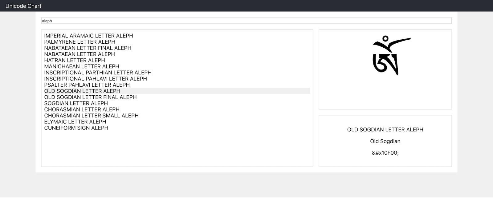
On smaller screens, the number of columns in the grid decreases, and the two cells on the right will automatically be placed below the search results.
Note that this behavior has been achieved without the use of media queries.
Add Authentication with Okta
When developing web applications, you will at some point be faced with the need to provide user authentication. There are ways to implement this yourself, but they are difficult and require a lot of experience in order to ensure they are safe. With Okta, you can avoid these problems and you can set up authentication with just a few lines of code. In addition, Okta provides a single sign-on service, which means that a single user account can be used for multiple applications.
Before you begin, you’ll need a free Okta developer account. Install the Okta CLI and run okta register to sign up for a new account. If you already have an account, run okta login.
Then, run okta apps create. Select the default app name, or change it as you see fit.
Choose Single-Page App and press Enter.
Use http://localhost:3000/callback for the Redirect URI and accept the default Logout Redirect URI of http://localhost:3000.
What does the Okta CLI do?
The Okta CLI will create an OIDC Single-Page App in your Okta Org. It will add the redirect URIs you specified and grant access to the Everyone group. It will also add a trusted origin for http://localhost:3000. You will see output like the following when it’s finished:
Okta application configuration:
Issuer:    https://dev-133337.okta.com/oauth2/default
Client ID: 0oab8eb55Kb9jdMIr5d6
NOTE: You can also use the Okta Admin Console to create your app. See Create a React App for more information.
Next, open the terminal in your project’s base directory and install the Okta React SDK and React Router by running the following commands.
npm install -E @okta/okta-react@3.0.4 react-router-dom@5.2.0
Now, open src/App.js and add the following two imports to the top of the file.
import { BrowserRouter as Router, Route } from 'react-router-dom';
import { LoginCallback, SecureRoute, Security } from '@okta/okta-react';
In the render() function, replace the <Unicode /> component with the code below.
<Router>
  <Security issuer='https://{YourOktaDomain}/oauth2/default'
            clientId='{ClientId}'
            redirectUri={window.location.origin + '/callback'}
            pkce={true}>
    <SecureRoute path='/' exact={true} component={Unicode}/>
    <Route path='/callback' component={LoginCallback}/>
  </Security>
</Router>
Here {YourOktaDomain} is your Okta domain that you can find on the Okta dashboard (in the top right), and {ClientId} is the client ID that you created earlier when you registered the application.
That’s it! You have secured your application. Now, if you stop your application and restart it (with npm start) you will have to log in to your Okta account before you will be able to access the Unicode browser.
NOTE: If you don’t see a login form, it’s because you’re already logged in. Using a private window will cause a redirect to Okta for authentication. If you’d rather have the login form in your application, you can use Okta’s Sign-In Widget with React.
Learn More About Styling Your Single-Page Applications
In this tutorial, I have shown you how to use CSS grid to style your single page application. The grid allows you to create a responsive layout without the use of media queries. This new CSS feature is not intended to replace the currently popular flexbox but should be used alongside giving you control and flexibility over the design on your website.
If you would like to learn more about using CSS with single-page applications, semantic markup, or React, feel free to check out the links below.
- Use Sass with React to Build Beautiful Apps
- Build a React App with Styled Components
- Build Beautiful Angular Apps with Bootstrap
- Build a Beautiful App + Login with Angular Material
You can find the code for this tutorial on GitHub at https://github.com/oktadeveloper/okta-react-css-grid-example.
If you liked this tutorial, chances are you like others we publish. Please follow @oktadev on Twitter and subscribe to our YouTube channel to get notified when we publish new developer tutorials.
Okta Developer Blog Comment Policy
We welcome relevant and respectful comments. Off-topic comments may be removed.