Build a React App with Styled Components

When you create React applications, at some point you have to make a decision on how to organize your CSS styles. For larger applications, you’ll have to modularize the stylesheets. Tools such as Sass and Less let you divide up your styles into separate files and provide lots of other features that make writing CSS files more productive. But some problems remain. The tools separate your styles from your components, and keeping the styles up-to-date with the rest of your code can be difficult. It is hard to figure out if a large application that has been developed and modified for several years still uses a particular CSS class. It is also not easy to make sure that changing a style in one part of your application doesn’t affect the appearance of some other unrelated component.
Note: In May 2025, the Okta Integrator Free Plan replaced Okta Developer Edition Accounts, and the Okta CLI was deprecated.
We preserved this post for reference, but the instructions no longer work exactly as written. Replace the Okta CLI commands by manually configuring Okta following the instructions in our Developer Documentation.
Styled Components to the Rescue
The solution to these problems is a concept known as scoped styles. Here you write CSS styles that apply only within a well-defined context. For example, you could write styles that apply only to a single React component. The Styled Components library implements this concept. You can create CSS styles directly in your JavaScript code and attach the style to an HTML tag or an existing component to create a new Styled Component. The styles are scoped and apply only that component. This has a number of advantages.
- You define components and styles in one place. If you remove a component from the application, you also remove the styles at the same time.
- Styles are scoped. They apply only to a single component, although you can apply styles to child components as well.
- Styles are dynamic. You can use any JavaScript expression in your stylesheets. You can also define styles depending on component properties.
In this tutorial, I will show you how to use Styled Components in your React application by creating a simple calendar application.
Prerequisites:
Create a React App
I will assume that you have some basic knowledge of React and that you have a recent version of Node installed on your system. Node comes with a couple of utility commands. Probably the best known of these is the node package manager npm. Less well known is the npx command that lets you run commands installed in your local repository. If it can’t find a command, npx will automatically install the commands before executing it.
You should always use the more recent versions of the React command-line interface with npx. This ensures that you are always using the latest version. To create a new React application, open a terminal, navigate to a directory of your choice, and run the following command.
npx create-react-app react-styled-calendar
This will create a new folder called react-styled-calendar and initialize a React application inside of it. To create the calendar, you will be using the moment package. This is a powerful package for time and date manipulation. Navigate into the newly created project folder and install the moment package.
cd react-styled-calendar
npm install -E moment@2.25.3
Now open your favorite editor, create a file src/Calendar.js, and create a new calendar component by pasting the code below into the file.
import React, { Component } from 'react';
import moment from 'moment';

export class Calendar extends Component {

  constructor(props) {
    super(props);
    this.state = {
      date: moment(),
    }
  }
}
Here the constructor simply initializes the component’s state with the current date. The component needs a method that creates all the days of the current month. For now, you will place every day of the month into a div element. Add the following method into the Calendar component.
createDaysOfMonth(refDate) {
  const date = moment(refDate).endOf('month');
  const lastDate = date.date();
  const firstWeekday = date.startOf('month').day();

  const calendarDays = [];

  const today = moment();

  for (let w=0; w<firstWeekday; w++) {
    calendarDays.push(<div key={Math.random()}/>); // empty days
  }

  for (let d=1; d<lastDate; d++) {
    calendarDays.push(<div key={d} today={date.date(d).isSame(today, 'day')}>{d}</div>);
  }

  while (calendarDays.length % 7 !== 0) {
    calendarDays.push(<div key={Math.random()}/>);
  }

  return calendarDays;
}
The first three lines figure out how many days the current month has and what day of the week the months start. A month view on a calendar typically has some empty fields at the beginning and end to account for the fact that the month doesn’t always start on the same weekday. The code adds this padding by using the first for loop and the last while loop. The middle for loop then adds all the days of the month by creating divs containing the date number.
You now need two methods to update the components state by navigating through the months. Add the following two methods to the Calendar component.
prevMonth() {
  this.setState({date: this.state.date.subtract(1, 'month')})
}

nextMonth() {
  this.setState({date: this.state.date.add(1, 'month')})
}
Now you are ready to render the calendar. The render() method shows the current month and year, two buttons for navigation, and then the month view. Paste the following code into the Calendar component.
render() {
return <div>
<h2>{this.state.date.format('MMMM YYYY')}</h2>
<div>
<button onClick={this.prevMonth.bind(this)}><</button>
<button onClick={this.nextMonth.bind(this)}>></button>
</div>
<div>
<div>Sunday</div>
<div>Monday</div>
<div>Tuesday</div>
<div>Wednesday</div>
<div>Thursday</div>
<div>Friday</div>
<div>Saturday</div>
{this.createDaysOfMonth(this.state.date)}
</div>
</div>;
}
To make the component show up in your application, you need to add it to the main application component. Open src/App.js and replace its content with the code below.
import React from 'react';
import { Calendar } from './Calendar';
import './App.css';

function App() {
  return (
    <div className="App">
      <Calendar/>
    </div>
  );
}

export default App;
You now have a fully functioning calendar that you can test by running the following command in the terminal.
npm start
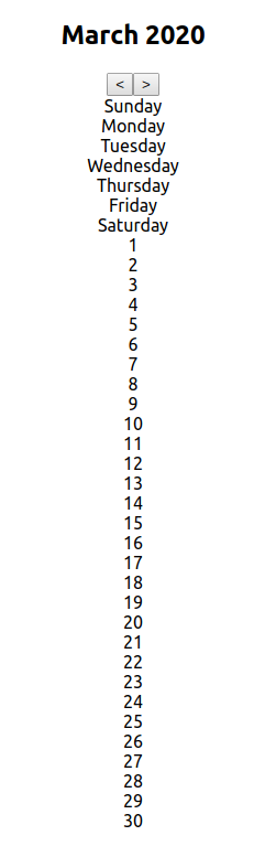
Open your browser at http://localhost:3000 and you can see your calendar. Click on the arrow buttons to browse through the months. Of course, the calendar hasn’t been styled yet, so all the days appear in one long column.
Add Authentication to Your React App
Many web applications need to be restricted to users that are registered to the service. With Okta, you can quickly set up secure authentication and control which users can access your application. In this section, I will show you how to add authentication to your React application. First, you will need to sign up for a free developer account with Okta.
Open your browser, navigate to https://developer.okta.com, follow the sign-in link, and complete the form that appears next. After you register, you will be taken to your Okta dashboard.
Select Applications in the top menu and create your first application by clicking the Add Application button. On the screen that appears next, select Single-Page App and click Next.
You will see a screen with settings. Make sure the port is set to 3000 and that the return URL is set to http://localhost:3000/callback. This is the port that your React application uses to run the development server. When you’re done, click on Done.
The resulting screen will provide you with a client ID, which you will need to copy and paste into your application in the following steps.
Now open your terminal and install the libraries that we need to enable authentication in the calendar application.
npm install -E @okta/okta-react@3.0.1 react-router-dom@5.1.2
Now open src/App.js and update its contents to match the following code.
import React from 'react';
import { Calendar } from './Calendar';
import './App.css';
import { BrowserRouter as Router, Route } from 'react-router-dom';
import { LoginCallback, SecureRoute, Security } from '@okta/okta-react';

function App() {
  return (
      <Router>
        <Security issuer='https://{YourOktaDomain}/oauth2/default'
                  clientId='{ClientId}'
                  redirectUri={window.location.origin + '/callback'}
               pkce={true}>
          <SecureRoute path='/' exact={true} component={Calendar}/>
          <Route path='/callback' component={LoginCallback}/>
        </Security>
      </Router>
  );
}

export default App;
In the code above, {ClientId} is the client ID that you obtained from the Okta dashboard and {YourOktaDomain} is your Okta domain. That’s it! You set up authentication and protected the calendar application from unauthorized access. There’s nothing more to it.
Add Styled Components to Your React App
Now, it is time to add some style to your application. In this section, I’ll show you how to install and use React Styled Components. First, install the styled-components package to your project. Open your terminal in the project root folder and run the following command.
npm install -E styled-components@5.1.0
Now create a new file src/CalendarComponents.js and create the basic components that will serve as container elements for your calendar.
import styled from 'styled-components';

export const CalendarWrapper = styled.div`
  display: flex;
  flex-direction: column;
  align-items: center;
`;

export const CalendarContainer = styled.div`
  width: 100%;
  max-width: 800px;
  display: flex;
  flex-wrap: wrap;
`;
JavaScript’s template literal mechanism creates Styled Components. Note the back-ticks surrounding the CSS strings in the code above. By prefixing a template string with one of the tags provided by styled-components, you create a new component. The code applies CSS to that component without affecting any other style or layout in your application. In the following button, you can see how you can nest styles and use the ampersand & in much the same way as you would use it in SASS.
export const PagingButton = styled.button`
  display: inline-block;
  background-color: #3f51b5;
  color: #ffffff;
  font-size: 24px;
  border: none;
  border-radius: 4px;
  margin: 12px;
  cursor: pointer;
  &:hover {
    background-color: #334296;
  }
`;
You can also use expressions and make the style dependent on the properties passed to the component. The following code styles the day fields of the calendar.
export const Day = styled.div`
  box-sizing: border-box;
  font-size: 24px;
  width: ${ 100 / 7 }%;
  padding: 8px;
  background-color: ${props => props.today ? '#3f51b5' : '#f0f0f0'};
  color: ${props => props.today ? '#ffffff' : '#000000'};
  border: 2px solid #ffffff;
  height: 64px;
`;
You might notice that the Day component looks to see if props.today is true. If it is, it assigns a different background color and text color. Finally, create a new component by adding style to an existing component. Call styled() with the component constructor.
export const DayHeader = styled(Day)`
  text-align: center;
  font-size: 16px;
  padding-top: 12px;
  height: 48px;
`;
Here I passed in the Styled Component Day, but you could have passed in any existing React component to add style to it.
Add the PagingButton, Day, and DayHeader constants to src/CalendarComponent.js.
Now it’s time to use all of the components you have created. Open src/Calendar.js and, at the top of the file, import the components.
import {
  CalendarWrapper,
  CalendarContainer,
  PagingButton,
  Day,
  DayHeader
} from './CalendarComponents'
Inside createDaysOfMonth(), replace all occurrences of the div tag with the Day tag. Then update the render() method to look as follows.
render() {
return <CalendarWrapper>
<h2>{this.state.date.format('MMMM YYYY')}</h2>
<div>
<PagingButton onClick={this.prevMonth.bind(this)}><</PagingButton>
<PagingButton onClick={this.nextMonth.bind(this)}>></PagingButton>
</div>
<CalendarContainer>
<DayHeader>Sunday</DayHeader>
<DayHeader>Monday</DayHeader>
<DayHeader>Tuesday</DayHeader>
<DayHeader>Wednesday</DayHeader>
<DayHeader>Thursday</DayHeader>
<DayHeader>Friday</DayHeader>
<DayHeader>Saturday</DayHeader>
{this.createDaysOfMonth(this.state.date)}
</CalendarContainer>
</CalendarWrapper>;
}
Note how you updated only the tags to use the new Styled Components. Nothing else has changed. Test your application again.
npm start
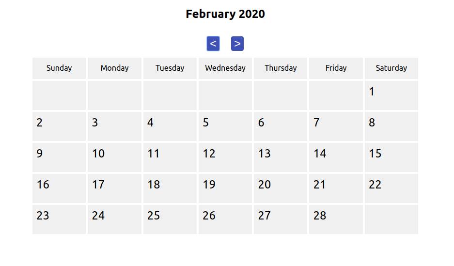
Open your browser again at http://localhost:3000 to see how your calendar looks now. After signing in with your Okta credentials, you should see something like the image below.
Congratulations! You learned the basics of how to create Styled Components and use them in your React applications.
Learn More About React and Styled Components
In this tutorial, I showed you how to create and use Styled Components in your React application. Styled Components allow you to create scoped CSS styles that apply to only a single type of component. This creates more stable applications because changes in a component’s style cannot accidentally cause style changes in an unrelated part of your application. You define the CSS in the same location as the component, which makes it easy to maintain the stylesheet code.
If you want to learn more about creating React applications, styling them, and making them secure, check out the links below.
- Build Reusable React Components
- Use Sass with React to Build Beautiful Apps
- A Quick Guide to Integrating React and GraphQL
- Build a Secure React Application with JWTs and Redux
The code for this tutorial is available at @oktadeveloper/okta-react-styled-components-example on GitHub.
If you liked this tutorial and want to be notified when we publish more, follow @oktadev on Twitter, subscribe to our YouTube channel, or follow us on LinkedIn. If you have a question, please leave a comment below.
Changelog:
- May 6, 2020: Updated to use the v3.0.1 version of the Okta React SDK. See the code changes in the example app on GitHub. Changes to this article can be viewed in oktadeveloper/okta-blog#284.
Okta Developer Blog Comment Policy
We welcome relevant and respectful comments. Off-topic comments may be removed.