How to Create a React App with Storybook

UI designers and front-end developers are tasked with creating clean and consistent user interfaces. At the same time, testing is a cornerstone of software development. Each part of a software project is tested individually and isolated from the other elements in unit tests. This practice has been challenging to achieve in the context of user interfaces.
Now Storybook provides an open-source framework that lets you test UI components in isolation from the rest of the website. Storybook presents you with a browser of all the components in your web application. You can test each component independently and in different configurations. The tool runs as a separate application outside your main application, which means that you can test your components without worrying about application-specific dependencies or requirements.
In this tutorial, I will show you how to use Storybook to create a simple React application. The application will be a unit conversion app, and I will use Storybook to showcase the individual components and the application page itself. I will not assume any prior knowledge of React or Storybook. I will assume that you are familiar with JavaScript and Node, and have an up-to-date version of the npm packet manager installed on your computer.
Prerequisites:
Table of Contents
- Creating React components with Storybook
- Creating the unit converter application using Storybook component stories
- Adding authentication with Okta to the application
- Learn more about React, Storybook, and Single-Page Apps
Note: In May 2025, the Okta Integrator Free Plan replaced Okta Developer Edition Accounts, and the Okta CLI was deprecated.
We preserved this post for reference, but the instructions no longer work exactly as written. Replace the Okta CLI commands by manually configuring Okta following the instructions in our Developer Documentation.
Creating React components with Storybook
In this section, I will show you how to create a React application and implement components displayed in Storybook. These components will serve as the basis for the unit conversion application. To start, open a terminal in a folder of your choice and run the following command to create a new React application.
npx create-react-app@5 react-storybook --use-npm
The create-react-app command creates a new folder, react-storybook, and initialises a basic application skeleton. Next, turn this basic React app into a Storybook application. Navigate into the newly created folder and run the following command.
npx sb@6 init
When prompted, answer yes to install the sb package. Initializing Storybook will create a new folder, stories inside the src folder, and populate it with some pre-made demo components and stories to be used by Storybook. Open the project folder in your favourite IDE.
You can test out storybook straight away. Open a terminal session in the project folder and run the following command.
npm run storybook
The command runs the Storybook app and opens a browser tab (http://localhost:6006). For now, you will only see the components that Storybook installs by default. You can keep Storybook running while you develop your app.
Using your IDE, create a new file named src/stories/Components.jsx. This will be the module that will contain some basic UI components. For the sake of this tutorial, I will place all these components into a single module. In practice, you might want to spread them out over several files. Open src/stories/Components.jsx and paste in the following code.
import React, { useState } from 'react';
import PropTypes from 'prop-types';
import './Components.css';

export function Input({ size, type, label, name, placeholder, onChange }) {
  return (
    <label className={`input-component input-component--${size}`}>
      <span>{label}</span>
      <input
        type={type==='text' ? 'text' : 'number'}
        step={type==='floating-point' ? 'any' : undefined}
        name={name}
        placeholder={placeholder}
        onChange={onChange}
      />
    </label>
  );
};

Input.propTypes = {
  size: PropTypes.oneOf(['medium', 'large']),
  type: PropTypes.oneOf(['text', 'number', 'floating-point']),
  label: PropTypes.string.isRequired,
  name: PropTypes.string.isRequired,
  placeholder: PropTypes.string.isRequired,
  onChange: PropTypes.func,
};

Input.defaultProps = {
  size: 'medium',
  type: 'text',
  label: 'Enter a value',
  name: 'input',
  placeholder: 'Please enter a value',
  onChange: undefined
};

export function Select({ size, label, options, onChange }) {
  return (
    <label className={`select-component select-component--${size}`}>
      <span>{label}</span>
      <select className="select-component" onChange={onChange}>
        {options.map((option) => <option value={option.value}>{option.description}</option>)}
      </select>
    </label>
  );
};

Select.propTypes = {
  size: PropTypes.oneOf(['medium', 'large']),
  label: PropTypes.string.isRequired,
  options: PropTypes.arrayOf(PropTypes.shape({
    value: PropTypes.string.isRequired,
    description: PropTypes.string.isRequired
  })).isRequired,
  onChange: PropTypes.func,
};

Select.defaultProps = {
  size: 'medium',
  label: 'Options',
  options: []
};

export function Tabs({ children }) {
  const [active, setActive] = useState(0);

  const onTabClick = (newActive) => () => {
    setActive(() => newActive);
  };

  return (
    <div className="tabs-component">
      <div className="tabs-row">
        {children.map((child, index) => <div className={`tab ${index === active ? "active" : ""}`} onClick={onTabClick(index)}>{child.props.label}</div>)}
      </div>
      <div className="tabs-content">
        {children[active]}
      </div>
    </div>
  );
};

Tabs.propTypes = {
  children: PropTypes.instanceOf(Array).isRequired,
};

Tabs.defaultProps = {
  children: []
};
This module exports three components. Input is a configurable <input> element with a label for entering text or numbers, Select is a dropdown <select> element wrapped in a label, and Tabs is a component that shows its children in a separate tab. I am using the React feature propTypes to specify the properties that each React component expects as arguments, allowing Storybook to extract this meta-information and display it to the user. To provide a bit of styling for the components, create a file src/stories/Components.css, and fill it with the following contents.
.input-component {
  display: flex;
  flex-direction: column;
  margin-bottom: 1rem;
}

.input-component span {
  display: block;
  margin-bottom: 0.5rem;
}

.input-component.input-component--large input {
  font-size: 1.2rem;
  padding: 0.5rem 1rem;
}

.select-component {
  display: flex;
  flex-direction: column;
  margin-bottom: 1rem;
}

.select-component span {
  display: block;
  margin-bottom: 0.5rem;
}

.select-component.select-component--large select {
  font-size: 1.2rem;
  padding: 0.5rem 1rem;
}

.tabs-component .tabs-row {
  font-family: 'Nunito Sans', 'Helvetica Neue', Helvetica, Arial, sans-serif;
  display: flex;
}

.tabs-component .tabs-row .tab {
  border: 1px solid #EEEEEE;
  border-bottom: none;
  border-top-right-radius: 4px;
  border-top-left-radius: 4px;
  padding: 0.5rem 1rem;
  cursor: pointer;
}

.tabs-component .tabs-row .tab.active {
  background-color: #EEEEEE;
  cursor: auto;
}

.tabs-component .tabs-content {
  border: 1px solid #EEEEEE;
  padding: 0.5rem 1rem;
}
With this, the components are usable as React components in your application. But you also want them to be browsable through Storybook. For this, you will need to create one file for each component. Start by creating a file src/stories/Input.stories.jsx and enter the following code in it.
import React from 'react';

import { Input } from './Components';

export default {
  title: 'Components/Input',
  component: Input,
};

const Template = (args) => <Input {...args} />;

export const Normal = Template.bind({});

Normal.args = {
  label: 'Normal Input',
  placeholder: 'Enter your value',
  size: 'normal'
};

export const Large = Template.bind({});

Large.args = {
  label: 'Large Input',
  placeholder: 'Enter your value',
  size: 'large'
};

export const Number = Template.bind({});

Number.args = {
  label: 'Integer Number',
  placeholder: 'Enter your value',
  size: 'large',
  type: 'number'
};

export const FloatingPoint = Template.bind({});

FloatingPoint.args = {
  label: 'Floating Point Number',
  placeholder: 'Enter your value',
  size: 'large',
  type: 'floating-point'
};
The export default at the top of the file tells Storybook what the component’s name is and which React component the stories in this file refer to. The subsequent exports Normal, Large, Number, and FloatingPoint represent individual stories or use cases for that component. Each story defines a member args that specifies the properties to pass to the component. Creating stories in this way is quick, so now create the next one for the Select component. Create a file src/stories/Select.stories.jsx and paste the following contents into it.
import React from 'react';

import { Select } from './Components';

export default {
  title: 'Components/Select',
  component: Select,
};

const Template = (args) => <Select {...args} />;

export const Default = Template.bind({});

Default.args = {
  size: 'medium',
  label: 'Select an Option',
  options: [
    { value: 'a', description: 'Option A' },
    { value: 'b', description: 'Option B' },
    { value: 'c', description: 'Option C' },
  ]
};

export const Large = Template.bind({});

Large.args = {
  size: 'large',
  label: 'Select an Option',
  options: [
    { value: 'a', description: 'Option A' },
    { value: 'b', description: 'Option B' },
    { value: 'c', description: 'Option C' },
  ]
};
This file defines two stories for the Select component. One story shows it in normal size, and the other shows it in a large size. Finally, do the same for the Tabs component. Create a file src/stories/Tabs.stories.jsx and fill it with the contents below.
import React from 'react';

import { Tabs } from './Components';

export default {
  title: 'Components/Tabs',
  component: Tabs,
};

const Template = (args) => <Tabs {...args} />;

export const Default = Template.bind({});

Default.args = {
  children: [
    <div label="One">Content One</div>,
    <div label="Two">Content Two</div>,
    <div label="Three">Content Three</div>,
  ]
};
Now, you are ready to test out your new components in Storybook. If you haven’t done so already, open the terminal in the project folder and run the following command.
npm run storybook
The command runs the Storybook app and opens a browser tab (http://localhost:6006). You can browse the components in the left sidebar. The stories you just created can be found under the Components header, and when you select, for example, the Input -> Number story, you should see something like shown in the image below.
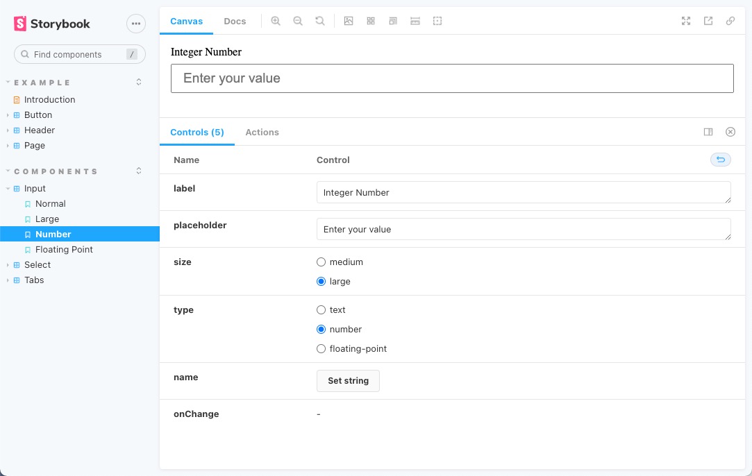
The component shows up in the main view, and the icons above let you change the background, the screen size, and even allow you to check the dimensions of the component’s layout. Below the main view, you can manually adjust the options passed to the component. I invite you to play around with all the features Storybook provides.
Creating the unit converter application using Storybook component stories
I will use the convert-units library to implement the unit conversion app. Open a second terminal in your project folder and run the command below.
npm install -E convert-units@2.3.4
Now, in your IDE, create a new file, src/stories/Converter.jsx, and fill it with the contents below.
import React, { useState } from 'react';
import PropTypes from 'prop-types';
import * as convert from 'convert-units';
import { Input, Select } from './Components';

export const Converter = ({measure}) => {
  const possibilities = convert().possibilities(measure).map((unit) => {
      const descr = convert().describe(unit);
      return {
          value: descr.abbr,
          description: `${descr.singular} (${descr.abbr})`
      };
  });

  const [fromUnit, setFromUnit] = useState(possibilities[0].value);
  const [toUnit, setToUnit] = useState(possibilities[0].value);
  const [fromValue, setFromValue] = useState(1);
  const [toValue, setToValue] = useState(convert(1).from(fromUnit).to(toUnit));

  const updateFromUnit = (event) => {
    setFromUnit(() => event.target.value);
    setToValue(() => convert(fromValue).from(event.target.value).to(toUnit));
  };

  const updateToUnit = (event) => {
    setToUnit(() => event.target.value);
    setToValue(() => convert(fromValue).from(fromUnit).to(event.target.value));
  };

  const updateValue = (event) => {
    setFromValue(() => event.target.value);
    setToValue(() => convert(event.target.value).from(fromUnit).to(toUnit));
  };

  return <div className="converter">
      <Select label="From:" options={possibilities} onChange={updateFromUnit}></Select>
      <Select label="To:" options={possibilities} onChange={updateToUnit}></Select>
      <Input label="Value:" type="floating-point" onChange={updateValue}></Input>
      <p>{fromValue} {fromUnit} = {toValue} {toUnit}</p>
  </div>
};

Converter.propTypes = {
  measure: PropTypes.string.isRequired
};

Input.defaultProps = {
  measure: 'length'
};
The component takes a single property called measure, which specifies the type of units to be converted and can be something like mass or length. The code for this component then consists of four parts. The first action is to query the convert-units library for all the possible unit conversion options. Units are mapped into an array of objects, ready to use with the Select component. In the next part, you’ll define four state properties, followed by three event handlers. These will react to a change in the user input and update the state accordingly. These event handlers contain the actual calls to the convert-units library where the unit conversion happens. Finally, the component is put together from all the parts and returned. You can also create a story for this more complex component with the individual components. Create a file src/stories/Converter.stories.jsx and paste in the following contents.
import React from 'react';
import { Converter } from './Converter';

export default {
  title: 'Components/Converter',
  component: Converter,
};

const Template = (args) => <Converter {...args} />;

export const Default = Template.bind({});

Default.args = {
  measure: 'length'
};

export const Mass = Template.bind({});

Mass.args = {
  measure: 'mass'
};
When you installed Storybook with the npx sb command, the initialization script added a few components as examples to demonstrate Storybook’s capabilities. You will be reusing two of these components for the unit-conversion app.
Open src/stories/Header.jsx and replace its contents with the following code.
import React from 'react';
import PropTypes from 'prop-types';
import { Button } from './Button';
import './header.css';

export const Header = ({ user, onLogin, onLogout }) => (
  <header>
    <div className="wrapper">
      <div>
        <h1>Unit Converter</h1>
      </div>
      {user ? <div> Hello {user.given_name} </div> : ""}
      <div>
        {user ? (
          <Button size="small" onClick={onLogout} label="Log out" />
        ) : (
          <>
            <Button size="small" onClick={onLogin} label="Log in" />
          </>
        )}
      </div>
    </div>
  </header>
);

Header.propTypes = {
  user: PropTypes.shape({}),
  onLogin: PropTypes.func.isRequired,
  onLogout: PropTypes.func.isRequired,
  onCreateAccount: PropTypes.func.isRequired,
};

Header.defaultProps = {
  user: null,
};
I have modified the header component to show the correct application name and allow some structured user data to be passed in. In the story for the header, in file src/stories/Header.stories.jsx, modify the arguments passed to the LoggedIn story to reflect this change.
LoggedIn.args = {
  user: {
    given_name: "Username"
  },
};
Now, open src/stories/Page.jsx and modify its contents to match the code below.
import React from 'react';
import PropTypes from 'prop-types';
import { Header } from './Header';
import './page.css';
import { Tabs } from './Components';
import { Converter } from './Converter';

export const Page = ({useAuth}) => {
  const [user, login, logout] = useAuth();
  return <article>
    <Header user={user} onLogin={login} onLogout={logout} />
    <section>
      <Tabs>
        <Converter measure="length" label="Length" key="length"></Converter>
        <Converter measure="mass" label="Mass" key="mass"></Converter>
        <Converter measure="volume" label="Volume" key="volume"></Converter>
      </Tabs>
    </section>
  </article>;
}

Page.propTypes = {
  useAuth: PropTypes.func.isRequired
};

Page.defaultProps = {
};
This component displays the application page, including the header and a tabbed container that allows switching between Converter components configured to convert different measures. The page needs a useAuth hook passed in that returns the user information and callbacks to log the user in or out. In the stories for the page, in src/stories/Page.stories.jsx, you need to create a mock function that supplies fake user data. Edit the contents of this file to look like the following code.
import React from 'react';
import { Page } from './Page';

export default {
  title: 'Pages/Page',
  component: Page,
};

const mockUseAuth = (loggedIn) => () => [
  loggedIn ? {given_name: "Username"} : undefined,
  () => {},
  () => {}
];

const Template = (args) => <Page useAuth={mockUseAuth(true)} {...args}/>;

export const LoggedIn = Template.bind({});
LoggedIn.args = {
  useAuth: mockUseAuth(true),
};

LoggedIn.parameters = {
  controls: { hideNoControlsWarning: true },
};

export const LoggedOut = Template.bind({});
LoggedOut.args = {
  useAuth: mockUseAuth(false),
};

LoggedOut.parameters = {
  controls: { hideNoControlsWarning: true },
};
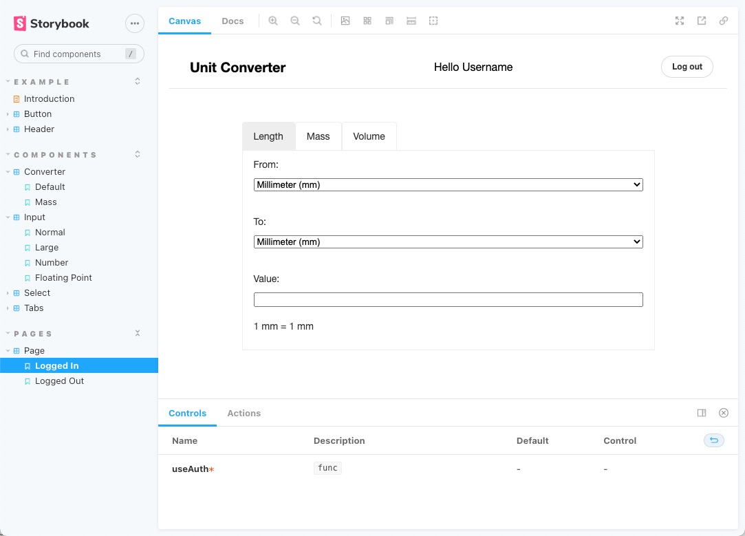
Note how mockUseAuth uses currying to return a function that can be used as the useAuth hook in the Page component. You can now use Storybook again to test the Converter component and the full application page. If it’s not still running, run npm run storybook again. You can navigate to Pages -> Page in the left sidebar, and you should see something like the image below.
Adding authentication with Okta to the application
You have created a page that uses an useAuth hook to manage user authentication. For the Storybook stories, you made a mock implementation of this hook. This section will show you how to implement the hook using Okta’s authentication service. First, register the application with Okta.
Before you begin, you’ll need a free Okta developer account. Install the Okta CLI and run okta register to sign up for a new account. If you already have an account, run okta login.
Then, run okta apps create. Select the default app name, or change it as you see fit.
Choose Single-Page App and press Enter.
Use http://localhost:3000/callback for the Redirect URI and set the Logout Redirect URI to http://localhost:3000.
What does the Okta CLI do?
The Okta CLI will create an OIDC Single-Page App in your Okta Org. It will add the redirect URIs you specified and grant access to the Everyone group. It will also add a trusted origin for http://localhost:3000. You will see output like the following when it’s finished:
Okta application configuration:
Issuer:    https://dev-133337.okta.com/oauth2/default
Client ID: 0oab8eb55Kb9jdMIr5d6
NOTE: You can also use the Okta Admin Console to create your app. See Create a React App for more information.
Next, install the necessary libraries. Open the terminal and run the command below.
npm install -E @okta/okta-react@6.4.1 @okta/okta-auth-js@5.10.0 react-dom@17.0.2 react-router-dom@5.3.0
Open the file src/index.js and modify its contents to match the code below.
import React from 'react';
import ReactDOM from 'react-dom';
import './index.css';
import { App } from './App';
import { Page } from './stories/Page';
import reportWebVitals from './reportWebVitals';
import { BrowserRouter as Router, Route, useHistory } from 'react-router-dom';
import { LoginCallback, SecureRoute, Security } from '@okta/okta-react';
import { OktaAuth, toRelativeUrl } from '@okta/okta-auth-js';
import { useAuth } from './auth';

const oktaAuth = new OktaAuth({
  issuer: 'https://{yourOktaDomain}/oauth2/default',
  clientId: '{clientID}',
  redirectUri: `/callback`,
});

function SecuredRoutes(props) {
  const history = useHistory();
  const restoreOriginalUri = async (_oktaAuth, originalUri) => {
    history.replace(toRelativeUrl(originalUri || '/', window.location.origin));
  };

  return (
    <Security oktaAuth={oktaAuth} restoreOriginalUri={restoreOriginalUri}>
      <Route path="/" exact render={(props) => <App {...props} useAuth={useAuth}/>} />
      <SecureRoute path="/converter" exact render={(props) => <Page {...props} useAuth={useAuth}/>} />
      <Route path="/callback" component={LoginCallback} />
    </Security>
  );
}

ReactDOM.render(
  <React.StrictMode>
    <Router>
      <SecuredRoutes />
    </Router>
  </React.StrictMode>,
  document.getElementById('root')
);

reportWebVitals();
Here {yourClientID} is the client ID that you obtained earlier and {yourOktaDomain} is your Okta domain. This change does several things. The oktaAuth instance provides a global authentication singleton. The main render function now contains a Router element that allows the application to navigate different routes. Finally, SecuredRoutes is a component that wraps the routes in a Security component. This component makes a useOktaAuth hook available for all components contained within it. Inside this component, you define the routes. Note how you pass a useAuth hook into the App and the Page components. Create a new file src/auth.js and add the following code to implement this hook.
import { useEffect, useState } from 'react';
import { useOktaAuth } from '@okta/okta-react';

export const useAuth = () => {
  const { oktaAuth, authState } = useOktaAuth();
  const [user, setUser] = useState(null);

  useEffect(() => {
    if (authState?.isAuthenticated) {
      if (!user) {
        oktaAuth.getUser().then(setUser);
      }
    } else {
      setUser(null);
    }
  }, [authState, user, oktaAuth]);

  const login = async () => oktaAuth.signInWithRedirect('/');
  const logout = async () => oktaAuth.signOut('/');

  return [user, login, logout];
};
Finally, you need to modify the existing App component to use the authentication hook. Open src/App.js and adjust the content to look like this.
import './App.css';
import { Link } from 'react-router-dom';
import { Header } from './stories/Header';

export const App = ({useAuth}) => {
  const [user, login, logout] = useAuth();

  return (
    <div className="App">
      <Header user={user} onLogin={login} onLogout={logout} />
      <h1>Unit Converter</h1>
      <p>
      <Link to="/converter">Go to the app!</Link>
      </p>
    </div>
  );
}
Congratulations, you have completed your React application with Storybook. You can now open the console in the project folder and run the following command to start the app.
npm start
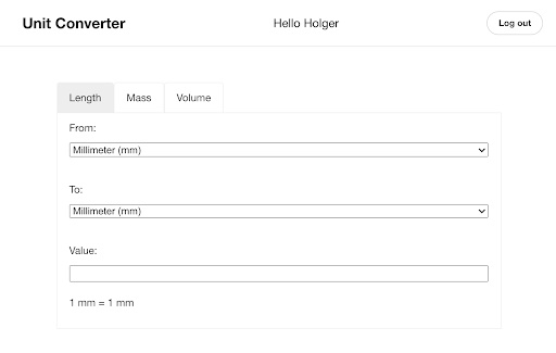
You should see the application’s front page in your browser. When you click the Go to the app! link, you’ll log in on the Okta page. After successfully signing in, you will redirect to the unit converter page, which looks like the image below.
Learn more about React, Storybook, and Single-Page Apps
In this tutorial, I have shown you how to create a React application and use Storybook to browse the application’s components. Storybook is a great tool that can enhance your development workflow.
- It lets you view and test your components in isolation.
- You can specify the location of each component in a hierarchical menu and then browse through the components in your browser.
- You can have multiple stories showcasing different use cases for each component.
- You can also modify the component parameters and see the impact on the visual appearance in real time.
- Storybook can keep running during the development process, and it will reflect any changes you make to your code.
The application you wrote was a simple unit-conversion app. I guided you on using the convert-units library to convert length, mass, and volume. You assembled the individual components to create a larger component containing multiple input elements. I have shown you how Storybook lets you create stories, test these complex components, and complete application pages.
If you want to learn more about any of these topics, please follow the links below.
- Build a React App with Styled Components
- The Best Testing Tools for Node.js
- Build a Simple React Application Using Hooks
- Develop Secure Apps with WebSockets and Node.js
You can find the code for this tutorial on GitHub at https://github.com/oktadev/okta-react-storybook-example.
If you liked this tutorial, chances are you like others we publish. Please follow @oktadev on Twitter and subscribe to our YouTube channel to get notified when we publish new developer tutorials.
Okta Developer Blog Comment Policy
We welcome relevant and respectful comments. Off-topic comments may be removed.