Stretch Your Imagination and Build a Delightful Sign-In Experience

When you choose Okta as your IAM provider, one of the features you get access to is customizing your Okta-hosted Sign-In Widget (SIW), which is our recommended method for the highest levels of identity security. It’s a customizable JavaScript component that provides a ready-made login interface you can use immediately as part of your web application.
The Okta Identity Engine (OIE) utilizes authentication policies to drive authentication challenges, and the SIW supports various authentication factors, ranging from basic username and password login to more advanced scenarios, such as multi-factor authentication, biometrics, passkeys, social login, account registration, account recovery, and more. Under the hood, it interacts with Okta’s APIs, so you don’t have to build or manage complex auth logic yourself. It’s all handled for you!
One of the perks of using the Okta SIW, especially with the 3rd Generation Standard (Gen3), is that customization is a configuration thanks to design tokens, so you don’t have to write CSS to style the widget elements.
Style the Okta Sign-In Widget to match your brand
In this tutorial, we will customize the Sign In Widget for a fictional to-do app. We’ll make the following changes:
- Replace font selections
- Define border, error, and focus colors
- Remove elements from the SIW, such as the horizontal rule and add custom elements
- Shift the control to the start of the site and add a background panel
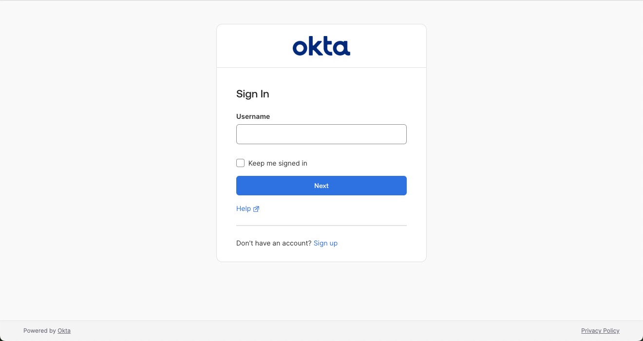
Without any changes, when you try to sign in to your Okta account, you see something like this:
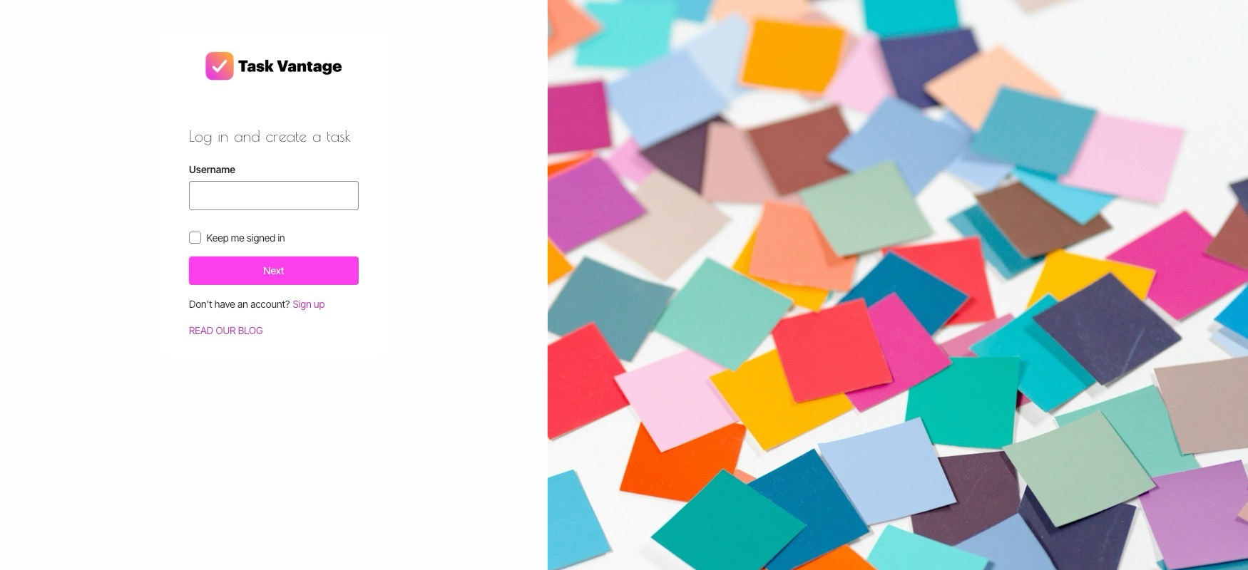
At the end of the tutorial, your login screen will look something like this 🎉
We’ll use the SIW gen3 along with new recommendations to customize form elements and style using design tokens.
Table of Contents
- Style the Okta Sign-In Widget to match your brand
- Customize your Okta-hosted sign-in page
- Understanding the Okta-hosted Sign-In Widget default code
- Customize the UI elements within the Okta Sign-In Widget
- Organize your Sign-In Widget customizations with CSS Custom properties
- Extending the SIW theme with a custom color palette
- Add custom HTML elements to the Sign-In Widget
- Overriding Okta Sign-In Widget element styles
- Change the layout of the Okta-hosted Sign-In page
- Customize your Gen3 Okta-hosted Sign-In Widget
Prerequisites To follow this tutorial, you need:
- An Okta account with the Identity Engine, such as the Integrator Free account. The SIW version in the org we’re using is 7.36.
- Your own domain name
- A basic understanding of HTML, CSS, and JavaScript
- A brand design in mind. Feel free to tap into your creativity!
Let’s get started!
Customize your Okta-hosted sign-in page
Before we begin, you must configure your Okta org to use your custom domain. Custom domains enable code customizations, allowing us to style more than just the default logo, background, favicon, and two colors. Sign in as an admin and open the Okta Admin Console, navigate to Customizations > Brands and select Create Brand +.
Follow the Customize domain and email developer docs to set up your custom domain on the new brand.
You can also follow this post if you prefer.
Redirecting to the Okta-hosted sign-in page is the most secure way to authenticate users in your application. But the default configuration yield a very neutral sign-in page. This post walks you through customization options and setting up a custom domain so the personality of your site shines all through the user's experience.
Once you have a working brand with a custom domain, select your brand to configure it. First, navigate to Settings and select Use third generation to enable the SIW Gen3. Save your selection.
⚠️ Note
The code in this post relies on using SIW Gen3. It will not work on SIW Gen2.
Navigate to Theme. You’ll see a default brand page that looks something like this:
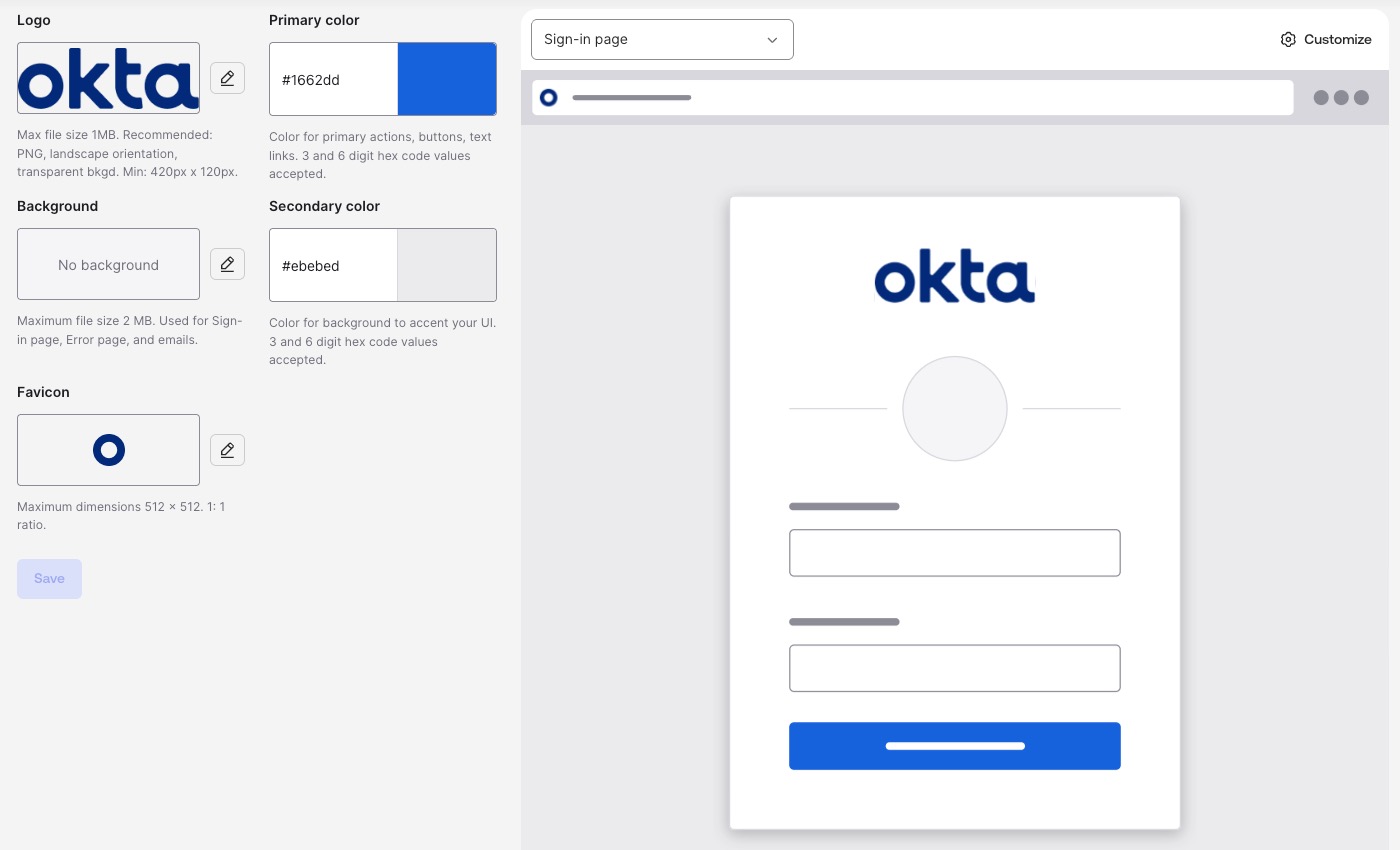
Let’s start making it more aligned with the theme we have in mind. Change the primary and secondary colors, then the logo and favicon images with your preferred options
To change either color, click on the text field and enter the hex code for each. We’re going for a bold and colorful approach, so we’ll use #ea3eda as the primary color and #ffa738 as the secondary color, and upload the logo and favicon images for the brand. Select Save.
Take a look at your sign-in page now by navigating to the sign-in URL for the brand. With your configuration, the sign-in widget looks more interesting than the default view, but we can make things even more exciting.
Let’s dive into the main task, customizing the signup page. On the Theme tab:
- Select Sign-in Page in the dropdown menu
- Select the Customize button
- On the Page Design tab, select the Code editor toggle to see a HTML page
Note: You can only enable the code editor if you configure a custom domain.
Understanding the Okta-hosted Sign-In Widget default code
If you’re familiar with basic HTML, CSS, and JavaScript, the sign-in code appears standard, although it’s somewhat unusual in certain areas. There are two major blocks of code we should examine: the top of the body tag on the page and the sign-in configuration in the script tag.
The first one looks something like this:
<div id="okta-login-container"></div>
The second looks like this:
var config = OktaUtil.getSignInWidgetConfig();

// Render the Okta Sign-In Widget
var oktaSignIn = new OktaSignIn(config);
oktaSignIn.renderEl({ el: '#okta-login-container' },
  OktaUtil.completeLogin,
  function(error) {
    // Logs errors that occur when configuring the widget.
    // Remove or replace this with your own custom error handler.
    console.log(error.message, error);
  }
);
Let’s take a closer look at how this code works. In the HTML, there’s a designated parent element that the OktaSignIn instance uses to render the SIW as a child node. This means that when the page loads, you’ll see the <div id="okta-login-container"></div> in the DOM with the HTML elements for SIW functionality as its child within the div. The SIW handles all authentication and user registration processes as defined by policies, allowing us to focus entirely on customization.
To create the SIW, we need to pass in the configuration. The configuration includes properties like the theme elements and messages for labels. The method renderEl() identifies the HTML element to use for rendering the SIW. We’re passing in #okta-login-container as the identifier.
The #okta-login-container is a CSS selector. While any correct CSS selector works, we recommend you use the ID of the element. Element IDs must be unique within the HTML document, so this is the safest and easiest method.
Customize the UI elements within the Okta Sign-In Widget
Now that we have a basic understanding of how the Okta Sign-In Widget works, let’s start customizing the code. We’ll start by customizing the elements within the SIW. To manipulate the Okta SIW DOM elements in Gen3, we use the afterTransform method. The afterTransform method allows us to remove or update elements for individual or all forms.
Find the button Edit on the Code editor view, which makes the code editor editable and behaves like a lightweight IDE.
Below the oktaSignIn.renderEl() method within the <script> tag, add
oktaSignIn.afterTransform('identify', ({ formBag }) => {
  const title = formBag.uischema.elements.find(ele => ele.type === 'Title');
  if (title) {
    title.options.content = "Log in and create a task";
  }

  const help = formBag.uischema.elements.find(ele => ele.type === 'Link' && ele.options.dataSe === 'help');
  const unlock = formBag.uischema.elements.find(ele => ele.type === 'Link' && ele.options.dataSe === 'unlock');
  const divider = formBag.uischema.elements.find(ele => ele.type === 'Divider');
  formBag.uischema.elements = formBag.uischema.elements.filter(ele => ![help, unlock, divider].includes(ele));
});
This afterTransform hook only runs before the ‘identify’ form. We can find and target UI elements using the FormBag. The afterTransform hook is a more streamlined way to manipulate DOM elements within the SIW before rendering the widget. For example, we can search elements by type to filter them out of the view before rendering, which is more performant than manipulating DOM elements after SIW renders. We filtered out elements such as the unlock account element and dividers in this snippet.
Let’s take a look at what this looks like. Press Save to draft and Publish.
Navigate to your sign-in URL for your brand to view the changes you made. When we compare to the default state, we no longer see the horizontal rule below the logo or the “Help” link. The account unlock element is no longer available.
We explored how we can customize the widget elements. Now, let’s add some flair.
Organize your Sign-In Widget customizations with CSS Custom properties
At its core, we’re styling an HTML document. This means we operate on the SIW customization in the same way as we would any HTML page, and code organization principles still apply. We can define customization values as CSS Custom properties (also known as CSS variables).
Defining styles using CSS variables keeps our code DRY. Setting up style values for reuse even extends beyond the Okta-hosted sign-in page. If your organization hosts stylesheets with brand color defined as CSS custom properties publicly, you can use the colors defined there and link your stylesheet.
Before making code edits, identify the fonts you want to use for your customization. We found a header and body font to use.
Open the SIW code editor for your brand and select Edit to make changes.
Import the fonts into the HTML. You can <link> or @import the fonts based on your preference. We added the <link> instructions to the <head> of the HTML.
<link rel="preconnect" href="https://fonts.googleapis.com">
<link rel="preconnect" href="https://fonts.gstatic.com" crossorigin>
<link href="https://fonts.googleapis.com/css2?family=Inter+Tight:ital,wght@0,100..900;1,100..900&family=Poiret+One&display=swap" rel="stylesheet">
Find the <style nonce="{{nonceValue}}"> tag. Within the tag, define your properties using the :root selector:
:root {
    --color-gray: #4f4f4f;
    --color-fuchsia: #ea3eda;
    --color-orange: #ffa738;
    --color-azul: #016fb9;
    --color-cherry: #ea3e84;
    --color-purple: #b13fff;
    --color-black: #191919;
    --color-white: #fefefe;
    --color-bright-white: #fff;
    --border-radius: 4px;
    --font-header: 'Poiret One', sans-serif;
    --font-body: 'Inter Tight', sans-serif;
 }
Feel free to add new properties or replace the property value for your brand. Now is a good opportunity to add your own brand colors and customizations!
Let’s configure the SIW with our variables using design tokens.
Find var config = OktaUtil.getSignInWidgetConfig();. After this line of code, set the values of the design tokens using your CSS Custom properties. You’ll use the var() function to access your variables:
config.theme = {
  tokens: {
    BorderColorDisplay: 'var(--color-bright-white)',
    PalettePrimaryMain: 'var(--color-fuchsia)',
    PalettePrimaryDark: 'var(--color-purple)',
    PalettePrimaryDarker: 'var(--color-purple)',
    BorderRadiusTight: 'var(--border-radius)',
    BorderRadiusMain: 'var(--border-radius)',
    PalettePrimaryDark: 'var(--color-orange)',
    FocusOutlineColorPrimary: 'var(--color-azul)',
    TypographyFamilyBody: 'var(--font-body)',
    TypographyFamilyHeading: 'var(--font-header)',
    TypographyFamilyButton: 'var(--font-body)',
    BorderColorDangerControl: 'var(--color-cherry)'
  }
}
Save your changes, publish the page, and view your brand’s sign-in URI site. Yay! You see, there’s no border outline, the border radius of the widget and HTML elements changed, a different focus color, and a different color for element outlines when there’s a form error. You can inspect the HTML elements and view the computed styles. Or if you prefer, feel free to update the CSS variables to something more visible.
When you inspect your brand’s sign-in URL site, you’ll notice that the fonts aren’t loading properly and that there are errors in your browser’s debugging console. This is because you need to configure Content Security Policies (CSP) to allow resources loaded from external sites. CSPs are a security measure to mitigate cross-site scripting (XSS) attacks. You can read An Overview of Best Practices for Security Headers to learn more about CSPs.
Navigate to the Settings tab for your brand’s Sign-in page. Find the Content Security Policy and press Edit. Add the domains for external resources. In our example, we only load resources from Google Fonts, so we added the following two domains:
*.googleapis.com
*.gstatic.com
Press Save to draft and press Publish to view your changes. The SIW now displays the fonts you selected!
Extending the SIW theme with a custom color palette
In our example, we selectively added colors. The SIW design system adheres to WCAG accessibility standards and relies on Material Design color palettes.
Okta generates colors based on your primary color that conform to accessibility standards and contrast requirements. Check out Understand Sign-In Widget color customization to learn more about color contrast and how Okta color generation works. You must supply accessible colors to the configuration.
Material Design supports themes by customizing color palettes. The list of all configurable design tokens displays all available options, including Hue* properties for precise color control. Consider exploring color palette customization options tailored to your brand’s specific needs. You can use Material palette generators such as this color picker from the Google team or an open source Material Design Palette Generator that allows you to enter a HEX color value.
Don’t forget to keep accessibility in mind. You can run an accessibility audit using Lighthouse in the Chrome browser and the WebAIM Contrast Checker. Our selected primary color doesn’t quite meet contrast requirements. 😅
Add custom HTML elements to the Sign-In Widget
Previously, we filtered HTML elements out of the SIW. We can also add new custom HTML elements to SIW. We’ll experiment by adding a link to the Okta Developer blog. Find the afterTransform() method. Update the afterTransform() method to look like this:
oktaSignIn.afterTransform('identify', ({formBag}) => {
  const title = formBag.uischema.elements.find(ele => ele.type === 'Title');
  if (title) {
    title.options.content = "Log in and create a task";
  }

  const help = formBag.uischema.elements.find(ele => ele.type === 'Link' && ele.options.dataSe === 'help');
  const unlock = formBag.uischema.elements.find(ele => ele.type === 'Link' && ele.options.dataSe === 'unlock');
  const divider = formBag.uischema.elements.find(ele => ele.type === 'Divider');
  formBag.uischema.elements = formBag.uischema.elements.filter(ele => ![help, unlock, divider].includes(ele));

  const blogLink = {
    type: 'Link',
    contentType: 'footer',
    options: {
      href: 'https://developer.okta.com/blog',
      label: 'Read our blog',
      dataSe: 'blogCustomLink'
    }
  };
  formBag.uischema.elements.push(blogLink);
});
We created a new element named blogLink and set properties such as the type, where the content resides, and options related to the type. We also added a dataSe property that adds the value blogCustomLink to an HTML data attribute. Doing so makes it easier for us to select the element for customization or for testing purposes.
When you continue past the ‘identify’ form in the sign-in flow, you’ll no longer see the link to the blog.
Overriding Okta Sign-In Widget element styles
We should use design tokens for customizations wherever possible. In cases where a design token isn’t available for your styling needs, you can fall back to defining style manually.
Let’s start with the element we added, the blog link. Let’s say we want to display the text in capital casing. It’s not good practice to define the label value using capital casing for accessibility. We should use CSS to transform the text.
In the styles definition, find the #login-bg-image-id. After the styles for the background image, add the style to target the blogCustomLink data attribute and define the text transform like this:
a[data-se="blogCustomLink"] {
    text-transform: uppercase;
}
Save and publish the page to check out your changes.
Now, let’s say you want to style an Okta-provided HTML element. Use design tokens wherever possible, and make style changes cautiously as doing so adds brittleness and security concerns.
Here’s a terrible example of styling an Okta-provided HTML element that you shouldn’t emulate, as it makes the text illegible. Let’s say you want to change the background of the Next button to be a gradient. 🌈
Inspect the SIW element you want to style. We want to style the button with the data attribute okta-sign-in-header.
After the blogCustomLink style, add the following:
button[data-se="save"] {
    background: linear-gradient(12deg, var(--color-fuchsia) 0%, var(--color-orange) 100%);
}
Save and publish the site. The button background is now a gradient.
However, style the Okta-provided SIW elements with caution. The dangers with this approach are two-fold:
- The Okta Sign-in widget undergoes accessibility audits, and changing styles and behavior manually may decrease accessibility thresholds
- The Okta Sign-in widget is internationalized, and changing styles around text layout manually may break localization needs
- Okta can’t guarantee that the data attributes or DOM elements remain unchanged, leading to customization breaks
In the rare case where you style an Okta-provided SIW element you may need to pin the SIW version so your customizations don’t break from under you. Navigate to the Settings tab and find the Sign-In Widget version section. Select Edit and select the most recent version of the widget, as this one should be compatible with your code. We are using widget version 7.36 in this post.
⚠️ Note
When you pin the widget, you won’t get the latest and greatest updates from the SIW without manually updating the version. Pinning the version prevents any forward progress in the evolution and extensibility of the end-user experiences. For the most secure option, allow SIW to update automatically and avoid overly customizing the SIW with CSS. Use the design tokens wherever possible.
Change the layout of the Okta-hosted Sign-In page
We left the HTML nodes defined in the SIW customization unedited so far. You can change the layout of the default <div> containers to make a significant impact. Change the display CSS property to make an impactful change, such as using Flexbox or CSS Grid. I’ll use Flexbox in this example.
Find the div for the background image container and the okta-login-container. Replace those div elements with this HTML snippet:
<div id="login-bg-image-id" class="login-bg-image tb--background">
    <div class="login-container-panel">
        <div id="okta-login-container"></div>
    </div>
</div>
We moved the okta-login-container div inside another parent container and made it a child of the background image container.
Find #login-bg-image style. Add the display: flex; property. The styles should look like this:
 #login-bg-image-id {
     background-image: {{bgImageUrl}};
     display: flex;
}
We want to style the okta-login-container’s parent <div> to set the background color and to center the SIW on the panel. Add new styles for the login-container-panel class:
.login-container-panel {
    background: var(--color-white);
    display: flex;
    justify-content: center;
    align-items: center;
    width: 40%;
    min-width: 400px;
}
Save your changes and view the sign-in page. What do you think of the new layout? 🎊
⚠️ Note
Flexbox and CSS Grid are responsive, but you may still need to add properties handling responsiveness or media queries to fit your needs.
Your final code might look something like this:
<!DOCTYPE html PUBLIC "-//W3C//DTD HTML 4.01//EN" "http://www.w3.org/TR/html4/strict.dtd">
<html>

<head>
    <meta http-equiv="Content-Type" content="text/html; charset=UTF-8">
    <meta name="viewport" content="width=device-width, initial-scale=1.0" />
    <meta name="robots" content="noindex,nofollow" />
    <!-- Styles generated from theme -->
    <link href="{{themedStylesUrl}}" rel="stylesheet" type="text/css">
    <!-- Favicon from theme -->
    <link rel="shortcut icon" href="{{faviconUrl}}" type="image/x-icon">
    <link rel="preconnect" href="https://fonts.googleapis.com">
    <link rel="preconnect" href="https://fonts.gstatic.com" crossorigin>
    <link href="https://fonts.googleapis.com/css2?family=Inter+Tight:ital,wght@0,100..900;1,100..900&family=Poiret+One&display=swap" rel="stylesheet">

    <title>{{pageTitle}}</title>
    {{{SignInWidgetResources}}}

    <style nonce="{{nonceValue}}">
        :root {
            --font-header: 'Poiret One', sans-serif;
            --font-body: 'Inter Tight', sans-serif;
            --color-gray: #4f4f4f;
            --color-fuchsia: #ea3eda;
            --color-orange: #ffa738;
            --color-azul: #016fb9;
            --color-cherry: #ea3e84;
            --color-purple: #b13fff;
            --color-black: #191919;
            --color-white: #fefefe;
            --color-bright-white: #fff;
            --border-radius: 4px;
        }

        {{ #useSiwGen3 }}

        html {
            font-size: 87.5%;
        }

        {{ /useSiwGen3 }}

        #login-bg-image-id {
            background-image: {{bgImageUrl}};
            display: flex;
        }

       .login-container-panel {
            background: var(--color-white);
            display: flex;
            justify-content: center;
            align-items: center;
            width: 40%;
            min-width: 400px;
        }

        a[data-se="blogCustomLink"] {
            text-transform: uppercase;
        }
    </style>
</head>

<body>
   <div id="login-bg-image-id" class="login-bg-image tb--background">
        <div class="login-container-panel">
            <div id="okta-login-container"></div>
        </div>
    </div>


    <!--
   "OktaUtil" defines a global OktaUtil object
   that contains methods used to complete the Okta login flow.
-->
    {{{OktaUtil}}}


    <script type="text/javascript" nonce="{{nonceValue}}">
        // "config" object contains default widget configuration
        // with any custom overrides defined in your admin settings.

        const config = OktaUtil.getSignInWidgetConfig();
        config.theme = {
            tokens: {
                BorderColorDisplay: 'var(--color-bright-white)',
                PalettePrimaryMain: 'var(--color-fuchsia)',
                PalettePrimaryDark: 'var(--color-purple)',
                PalettePrimaryDarker: 'var(--color-purple)',
                BorderRadiusTight: 'var(--border-radius)',
                BorderRadiusMain: 'var(--border-radius)',
                PalettePrimaryDark: 'var(--color-orange)',
                FocusOutlineColorPrimary: 'var(--color-azul)',
                TypographyFamilyBody: 'var(--font-body)',
                TypographyFamilyHeading: 'var(--font-header)',
                TypographyFamilyButton: 'var(--font-body)',
                BorderColorDangerControl: 'var(--color-cherry)'
            }
        }

        // Render the Okta Sign-In Widget
        const oktaSignIn = new OktaSignIn(config);
        oktaSignIn.renderEl({ el: '#okta-login-container' },
            OktaUtil.completeLogin,
            function (error) {
                // Logs errors that occur when configuring the widget.
                // Remove or replace this with your own custom error handler.
                console.log(error.message, error);
            }
        );

        oktaSignIn.afterTransform('identify', ({ formBag }) => {
            const title = formBag.uischema.elements.find(ele => ele.type === 'Title');
            if (title) {
                title.options.content = "Log in and create a task";
            }

            const help = formBag.uischema.elements.find(ele => ele.type === 'Link' && ele.options.dataSe === 'help');
            const unlock = formBag.uischema.elements.find(ele => ele.type === 'Link' && ele.options.dataSe === 'unlock');
            const divider = formBag.uischema.elements.find(ele => ele.type === 'Divider');
            formBag.uischema.elements = formBag.uischema.elements.filter(ele => ![help, unlock, divider].includes(ele));

            const blogLink = {
                type: 'Link',
                contentType: 'footer',
                options: {
                    href: 'https://developer.okta.com/blog',
                    label: 'Read our blog',
                    dataSe: 'blogCustomLink'
                }
            };
            formBag.uischema.elements.push(blogLink);
        });

    </script>


</body>

</html>
You can also find the code in the GitHub repository for this blog post. With these code changes, you can connect this with an app to see how it works end-to-end. You’ll need to update your Okta OpenID Connect (OIDC) application to work with the domain. In the Okta Admin Console, navigate to Applications > Applications and find the Okta application for your custom app. Navigate to the Sign On tab. You’ll see a section for OpenID Connect ID Token. Select Edit and select Custom URL for your brand’s sign-in URL as the Issuer value.
You’ll use the issuer value, which matches your brand’s custom URL, and the Okta application’s client ID in your custom app’s OIDC configuration. If you want to try this and don’t have a pre-built app, you can use one of our samples, such as the Okta React sample.
Customize your Gen3 Okta-hosted Sign-In Widget
I hope you enjoyed customizing the sign-in experience for your brand. Using the Okta-hosted Sign-In widget is the best, most secure way to add identity security to your sites. With all the configuration options available, you can have a highly customized sign-in experience with a custom domain without anyone knowing you’re using Okta.
If you like this post, there’s a good chance you’ll find these links helpful:
- Create a React PWA with Social Login Authentication
- Secure your first web app
- How to Build a Secure iOS App with MFA
Remember to follow us on Twitter and subscribe to our YouTube channel for fun and educational content. We also want to hear from you about topics you want to see and questions you may have. Leave us a comment below! Until next time!
Emmanuel is a software engineer @toptal. He enjoys trying out and learning new technologies and has written articles on a small number of topics. In his free time he learns the guitar and plays video games.
Alisa Duncan is a Senior Developer Advocate at Okta, a full-stack developer, and a community builder who loves the thrill of learning new things. She is a Google Developer Expert in Angular and organizes coding workshops and community events locally and internationally. Her background is primarily working on enterprise software platforms, and she is a fan of all things TypeScript and JavaScript.
Okta Developer Blog Comment Policy
We welcome relevant and respectful comments. Off-topic comments may be removed.