On this page
Style the Sign-In Widget (third generation)
This guide explains how to customize the third-generation (Gen3) of the Sign-In Widget for redirect authentication.
Notes:
- See Migrate to the third generation (Gen3) of the Sign-In Widget for details about a migration to Gen3.
- See Style the sign-in page if you’re using Okta Classic Engine.
- See Identify your Okta solution (opens new window) to determine your Okta version.
Learning outcomes
- Learn about palette generation and accessibility.
- Learn about design tokens.
What you need
Sample code
About the third generation Sign-In Widget
The Sign-In Widget enables the following:
- Registration
- Enrollment
- Verification
- Recovery
It's where everyone in your org starts their Okta session.
Gen3 of the Sign-In Widget offers the same user experience as Gen2. It adds accessibility improvements to the following:
- Color contrast
- Focus management
- Screen reader behavior
See Sign-In Widget, third generation (opens new window) to verify if the third generation is right for your org.
See Migrate to the third generation (Gen3) of the Sign-In Widget for details about a migration to Gen3.
Palette generation and accessibility
Gen3 of the Sign-In Widget provides autogenerated palettes that preserve accessible color contrast ratios.
Consider the following when adjusting the theme of your org:
If you don't modify your theme, your org uses the default Okta palette.
If you modify your theme using the primary color in the Admin Console, Okta generates an accessible palette. However, the generated palette might not map exactly to your brand's palette. See Understand Sign-In Widget color customization (opens new window).
If you modify your theme using design tokens, you can create themes that closely align with your brand's palette. For example, you can use the code editor to modify
PalettePrimaryMainto have the exact hex code of your brand. However, if you use design tokens it's at your own risk. You're responsible for your use of the tokens and any broken accessibility ratios that could result. See Use design tokens.
jQuery and Preact
Gen3 is built on Preact (opens new window), a lightweight React Native (opens new window) alternative. The architecture changes from jQuery-based (Gen2) to Preact-based (Gen3). As a result, each generation of the Sign-In Widget handles DOM manipulations in a different way.
For example, the afterRender function doesn’t work in Gen3 as it does in Gen2. See the Migrate to the third generation (Gen3) guide for more information.
Use the code editor
Use the code editor to add design tokens to your code. Design tokens call a JavaScript API.
Note: You can only enable the code editor if you configure a custom domain.
See Customization examples for snippets that you can update and use.
In the Admin Console, go to Customizations > Brands, and then select the brand you want.
On the Pages tab, click Configure in the Sign-in page panel.
To open the code editor, click the Code editor toggle.
Make changes directly in the editor. See Use design tokens.
- Click Save to draft, then Preview, Revert, or Publish.
- Select Compare with published version to see the difference between your edited version and the published version. You can choose between a split view and a unified view.
Note: To discard your changes without publishing them, click Revert changes or click the Code editor toggle again. Turning off the code editor restores the default JavaScript code.
Use design tokens
Design tokens make the Sign-In Widget's visual style consistent and easier to update. Tokens replace static values to customize the following:
- Color
- Border
- Font family
- Font size
- Font weight
- Line height
- Spacing
Pass the design token values into the OktaSignIn constructor. For example:
new OktaSignIn({
  theme: {
    tokens: {
      PalettePrimaryMain: '#D11DCA',
      TypographyColorBody: '#00297A',
      TypographyColorHeading: '#00297A',
      TypographyFamilyHeading: 'Helvetica',
      TypographyFamilyBody: 'Helvetica',
      TypographyWeightHeading: 600,
      BorderRadiusMain: '24px',
      Spacing5: '2.85714286rem',
    }
  }
});
The following is a list of available design tokens with default values. See Customization examples:
{
  "BorderColorDisplay": "#e1e1e1",
  "BorderColorDisabled": "#e1e1e1",
  "BorderColorDangerLight": "#fe8f7a",
  "BorderColorDangerControl": "#e72500",
  "BorderColorDangerDark": "#951800",
  "BorderColorPrimaryControl": "#546be7",
  "BorderColorPrimaryDark": "#2e40a5",
  "BorderRadiusTight": "4px",
  "BorderRadiusMain": "6px",
  "BorderStyleMain": "solid",
  "BorderWidthMain": "1px",
  "FocusOutlineColorPrimary": "#546be7",
  "FocusOutlineOffsetMain": "2px",
  "FocusOutlineOffsetTight": "0",
  "FocusOutlineStyle": "solid",
  "FocusOutlineWidthMain": "2px",
  "FocusOutlineWidthTight": "1px",
  "HueNeutral50": "#f4f4f4",
  "HueNeutral100": "#ededed",
  "HueNeutral200": "#e1e1e1",
  "HueNeutral300": "#cbcbcb",
  "HueNeutral400": "#aeaeae",
  "HueNeutral500": "#8d8d8d",
  "HueNeutral600": "#6e6e6e",
  "HueNeutral700": "#4b4b4b",
  "HueNeutral800": "#383838",
  "HueNeutral900": "#272727",
  "HueNeutralWhite": "#ffffff",
  "HueBlue50": "#f2f3fd",
  "HueBlue100": "#dbe0fa",
  "HueBlue200": "#c1c9f6",
  "HueBlue300": "#9daaf1",
  "HueBlue400": "#7286eb",
  "HueBlue500": "#546be7",
  "HueBlue600": "#4c64e1",
  "HueBlue700": "#2e40a5",
  "HueBlue800": "#22307c",
  "HueBlue900": "#182257",
  "HueGreen50": "#defae7",
  "HueGreen100": "#94f5b3",
  "HueGreen200": "#7be09e",
  "HueGreen300": "#59c282",
  "HueGreen400": "#31a061",
  "HueGreen500": "#16884a",
  "HueGreen600": "#197f48",
  "HueGreen700": "#0e562f",
  "HueGreen800": "#0a4023",
  "HueGreen900": "#072e19",
  "HueRed50": "#fff0ee",
  "HueRed100": "#ffd8d1",
  "HueRed200": "#febbae",
  "HueRed300": "#fe8f7a",
  "HueRed400": "#fd4e2d",
  "HueRed500": "#e72500",
  "HueRed600": "#d92300",
  "HueRed700": "#951800",
  "HueRed800": "#711200",
  "HueRed900": "#500d00",
  "HueYellow50": "#fcf6ac",
  "HueYellow100": "#fce101",
  "HueYellow200": "#f9c503",
  "HueYellow300": "#eb9e05",
  "HueYellow400": "#bf8004",
  "HueYellow500": "#a16c03",
  "HueYellow600": "#966603",
  "HueYellow700": "#664402",
  "HueYellow800": "#4c3302",
  "HueYellow900": "#352401",
  "PalettePrimaryLighter": "#f2f3fd",
  "PalettePrimaryLight": "#9daaf1",
  "PalettePrimaryMain": "#546be7",
  "PalettePrimaryDark": "#2e40a5",
  "PalettePrimaryDarker": "#22307c",
  "PalettePrimaryText": "#4c64e1",
  "PalettePrimaryHeading": "#182257",
  "PalettePrimaryHighlight": "#dbe0fa",
  "PaletteDangerLighter": "#fff0ee",
  "PaletteDangerLight": "#fe8f7a",
  "PaletteDangerMain": "#e72500",
  "PaletteDangerDark": "#951800",
  "PaletteDangerDarker": "#711200",
  "PaletteDangerText": "#d92300",
  "PaletteDangerHeading": "#500d00",
  "PaletteDangerHighlight": "#ffd8d1",
  "PaletteWarningLighter": "#fcf6ac",
  "PaletteWarningLight": "#eb9e05",
  "PaletteWarningMain": "#a16c03",
  "PaletteWarningDark": "#664402",
  "PaletteWarningDarker": "#4c3302",
  "PaletteWarningText": "#966603",
  "PaletteWarningHeading": "#352401",
  "PaletteWarningHighlight": "#fce101",
  "PaletteSuccessLighter": "#defae7",
  "PaletteSuccessLight": "#59c282",
  "PaletteSuccessMain": "#16884a",
  "PaletteSuccessDark": "#0e562f",
  "PaletteSuccessDarker": "#0a4023",
  "PaletteSuccessText": "#197f48",
  "PaletteSuccessHeading": "#072e19",
  "PaletteSuccessHighlight": "#94f5b3",
  "Spacing0": "0",
  "Spacing1": "0.28571429rem",
  "Spacing2": "0.57142857rem",
  "Spacing3": "0.85714286rem",
  "Spacing4": "1.14285714rem",
  "Spacing5": "1.71428571rem",
  "Spacing6": "2.28571429rem",
  "Spacing7": "2.85714286rem",
  "Spacing8": "3.42857143rem",
  "Spacing9": "4rem",
  "TransitionDurationMain": "100ms",
  "TypographyColorBody": "#272727",
  "TypographyColorHeading": "#272727",
  "TypographyColorInverse": "#ffffff",
  "TypographyColorSupport": "#4b4b4b",
  "TypographyColorSubordinate": "#6e6e6e",
  "TypographyColorDisabled": "#aeaeae",
  "TypographyColorAction": "#4c64e1",
  "TypographyColorDanger": "#d92300",
  "TypographyColorSuccess": "#197f48",
  "TypographyColorWarning": "#966603",
  "TypographyFamilyBody": "'Inter', '-apple-system', 'BlinkMacSystemFont', 'Segoe UI', 'Oxygen-Sans', 'Ubuntu', 'Cantarell', 'Helvetica Neue', sans-serif",
  "TypographyFamilyHeading": "'Aeonik', 'Inter', '-apple-system', 'BlinkMacSystemFont', 'Segoe UI', 'Oxygen-Sans', 'Ubuntu', 'Cantarell', 'Helvetica Neue', sans-serif",
  "TypographyFamilyButton": "'Aeonik', 'Inter', '-apple-system', 'BlinkMacSystemFont', 'Segoe UI', 'Oxygen-Sans', 'Ubuntu', 'Cantarell', 'Helvetica Neue', sans-serif",
  "TypographySizeSubordinate": "0.857rem",
  "TypographySizeBody": "1rem",
  "TypographySizeHeading6": "1.143rem",
  "TypographySizeHeading5": "1.286rem",
  "TypographySizeHeading4": "1.571rem",
  "TypographySizeHeading3": "2rem",
  "TypographySizeHeading2": "2.286rem",
  "TypographySizeHeading1": "2.571rem",
  "TypographyWeightBody": "400",
  "TypographyWeightBodyBold": "600",
  "TypographyWeightHeading": "500",
  "TypographyWeightHeadingBold": "700",
  "TypographyLineHeightBody": 1.5,
  "TypographyLineHeightUi": 1.2,
  "TypographyLineHeightOverline": 1.3,
  "TypographyLineHeightHeading6": 1.3,
  "TypographyLineHeightHeading5": 1.3,
  "TypographyLineHeightHeading4": 1.25,
  "TypographyLineHeightHeading3": 1.25,
  "TypographyLineHeightHeading2": 1.2,
  "TypographyLineHeightHeading1": 1.2,
  "TypographyLineLengthMax": "55ch"
}
Customization examples
The following examples illustrate the impact of basic changes:
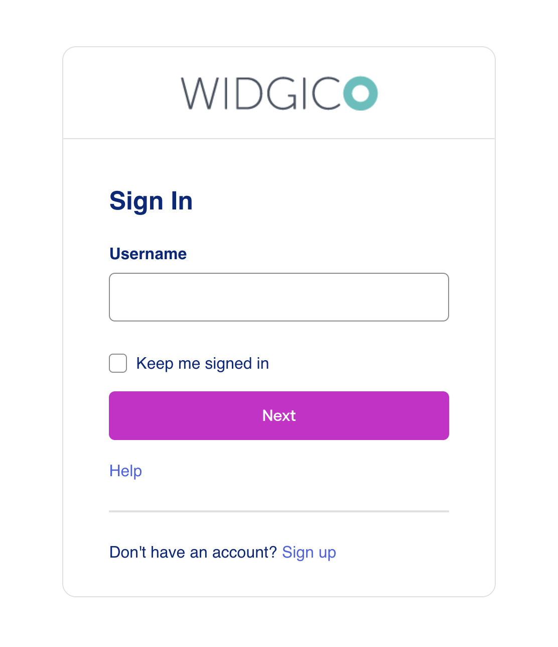
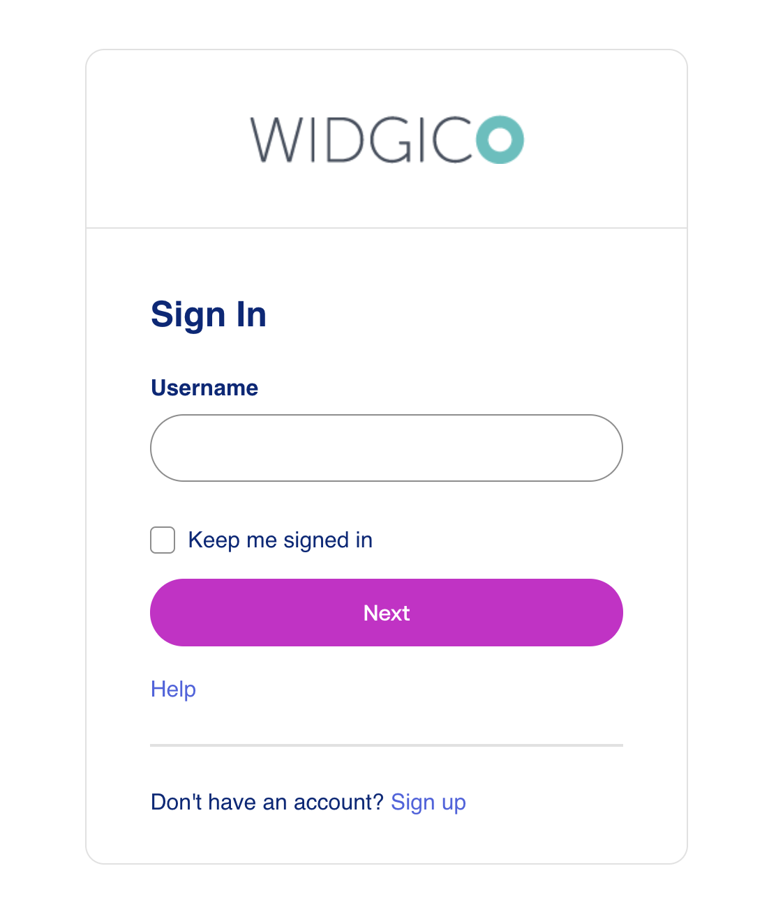
Color change
PalettePrimaryMainfrom#546be7(blue) to#D11DCA(magenta)TypographyColorBodyfrom#272727(dark gray) to#00297A(navy blue)TypographyColorHeadingfrom#272727(dark gray) to#00297A(navy blue)
Before color changes

After color changes

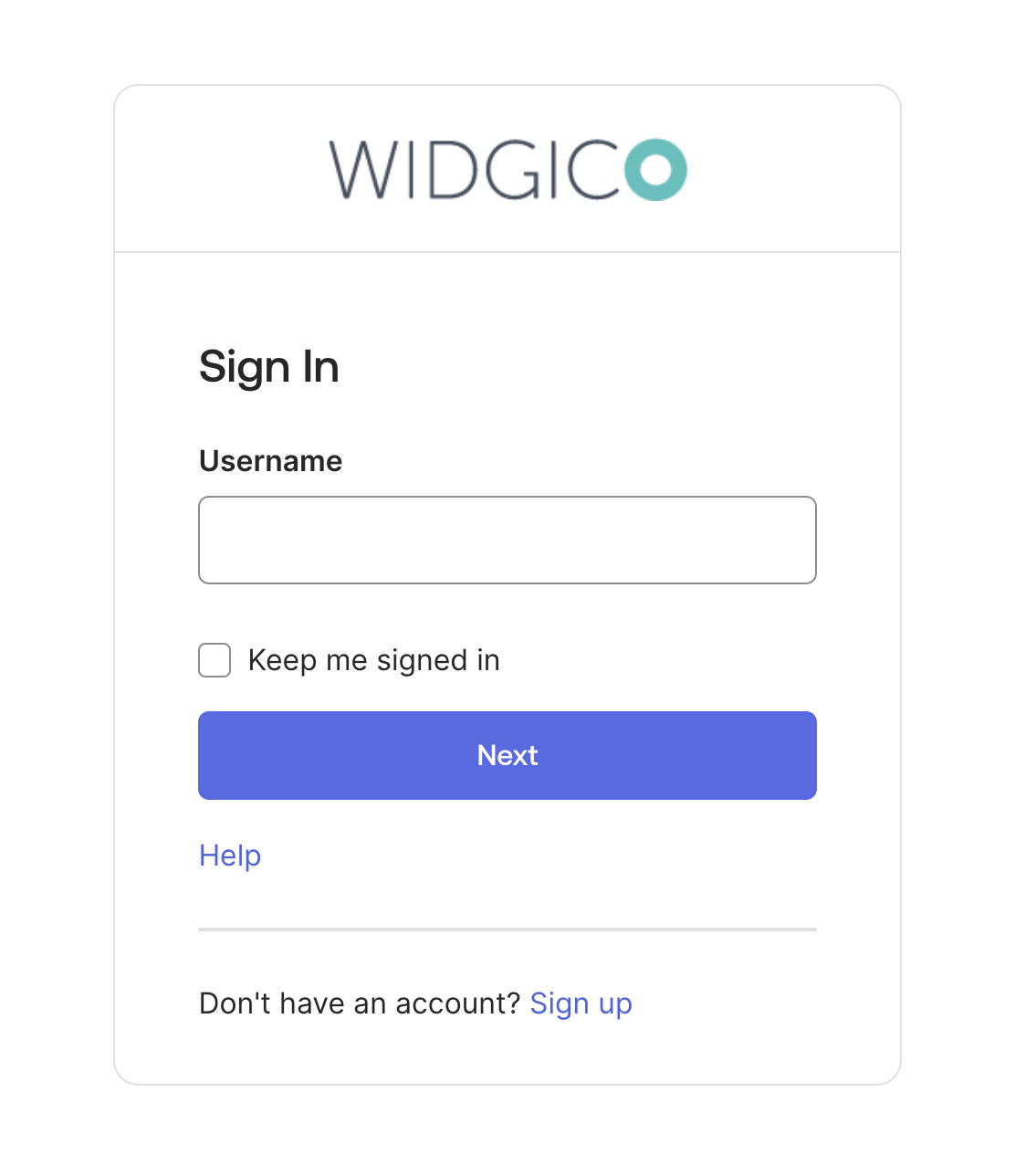
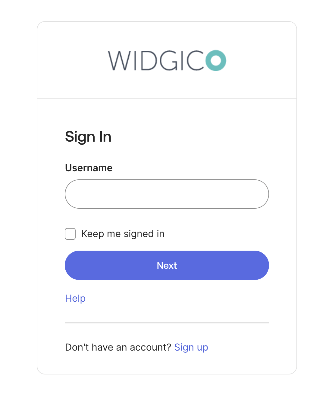
Text change
TypographyFamilyHeadingfrom"'Aeonik', 'Inter', '-apple-system', 'BlinkMacSystemFont', 'Segoe UI', 'Roboto', 'Oxygen-Sans', 'Ubuntu', 'Cantarell', 'Helvetica Neue', sans-serif"(default) to"Helvetica"TypographyWeightHeadingfrom500(semibold, default) to600(bold)TypographyFamilyBodyfrom"'Inter', '-apple-system', 'BlinkMacSystemFont', 'Segoe UI', 'Roboto', 'Oxygen-Sans', 'Ubuntu', 'Cantarell', 'Helvetica Neue', sans-serif"(default) to"Helvetica"
Before text changes

After text changes

After color and text changes
Border radius and spacing change
BorderRadiusMainfrom6pxto24pxSpacing5from1.71428571rem(24 px, default) to2.85714286rem(40 px)
Before border radius and spacing changes
After border radius and spacing changes
After border, spacing, text, and color changes